How I Turned the Rich Italian Tradition into this Restaurant's Story.
Il Podere wasn’t just about dining, but about creating a modern love letter to tradition, flavour, and human connection. Bringing a modern Italian restaurant’s story to life through emotional branding, visual storytelling, and a full-spectrum digital strategy — rooted in tradition, designed for today.
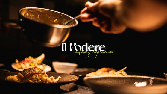
Il Podere, a jewel nestled amidst the Tuscan hills, is more than just a restaurant. It's a sanctuary of taste, a celebration of the land, and a testament to the enduring spirit of Italy. This project is a quest to encapsulate the soul of this extraordinary place, translating its rich heritage and breathtaking beauty into a visual language that is as captivating as the cuisine it represents.
Il Podere had the vision, a culinary genius who honoured Italian tradition, respected the earth’s ingredients, and celebrated the people who bring food to the table. Their kitchen masterfully bridged rustic roots with contemporary dining. But their brand story didn’t. Online, Il Podere lacked the emotional connection today's guests crave: a sense of nostalgia, sustainability, and authenticity. They wanted diners to feel the warmth of their mother’s cooking, to smell dishes that carried the memory of their grandmother’s kitchen, yet their brand presence felt detached, static, and unclear.
SCOPE
Brand Strategy
Marketing Strategy
Public Relations
Storytelling

Role Played
-
Hosted brand discovery sessions to define Il Podere’s emotional DNA.
-
Built a brand positioning strategy around nostalgia, sustainability, and authenticity.
-
Developed a media-ready brand story for PR and guest-facing communications.
-
Refined public voice to blend rustic warmth with modern elegance.
-
Created storytelling guidelines for social media, website, and future PR materials.
The challenge wasn’t the food. It was telling a story that made guests feel at home before they ever took a bite.

Brand Story
In the heart of Tuscany, where sunlight dances on emerald fields and whispers through ancient olive groves, resides a dream woven into reality: Il Podere. A woven tale of green and gold, it is a place where nature's palette meets human artistry.
A palette of Dark Moss, Silk Green, Cornsilk, Earth-Yellow, and Baby-Wine evokes the region’s sun-drenched landscapes while the Dahlia font, with its graceful curves, dances like a summer breeze through the brand's identity. It is the whisper of luxury, a promise of indulgence. Beside it, the stalwart EB Garamond, a seasoned storyteller, lends its wisdom to the narrative. And Gotham, the modern companion, ensures every word is heard.
Together, these elements weave a spellbinding tale. Imagine a logo where the hills and creeks, a symbol of peace and abundance, are rendered in the soft hues of the Tuscan landscape. The letters, cast in the warm glow of the setting sun, invite you to step into a world of enchantment.


Brand Colours
The brand, a living entity, was born from the earth itself. Its essence, is captured in hues of Dark Moss, Silk Green, Cornsilk, Earth-Yellow, and Baby-Wine is a symphony of sunlight, shadow, and soil. Like magic potions, these colours conjure visions of sun-kissed vineyards and fragrant cypress trees.
The restaurant itself is a continuation of this magic. Wood, stone, and linen, the earth's embrace, welcome guests into a space bathed in soft, diffused light. The air is filled with the promise of exquisite flavours, and the spirit of the land lingers in every corner. Il Podere is not merely a place to dine; it is an experience that lingers in the heart, a memory painted with the colours of Tuscany.


Key Wins
-
Positioned Il Podere as a culinary memory experience, not just a restaurant
-
Developed PR storylines that attracted early regional media interest
-
Set up a scalable voice and story system for future PR expansion and collaborations